
"Chirp, chirp, chirp." Crickets have taken over my blog of late. A lot of personal stuff has taken over my crafting time so my blog has suffered the last two weeks. When I have had time, my mojo has seemed to disappear. I know we all go through it but it is so annoying!!
I had a little time to actually play yesterday and made two different cards for the "As You See It Challenge #147." I used the sketch and pulled from the pile on my desk for the first card.

The sketch that I pulled this from is below. There is also a kind of "theme" to go with it to interpret the sketch: Lacey and Lovely. It is up to you to interpret what goes across the top-lace or patterned paper?

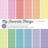
I chose yellow gingham patterned paper as the large panel that goes partially across the top. This was actually my second choice. I first used a stencil and stenciled some lace BUT as it often is with me, I messed up and went out of the lines. So my second choice was my yellow paper. It went well with the yellow flower and was a good contrast to the red.

I added a vellum die cut underneath the circle for some intent and instead of stamping a sentiment underneath the patterned paper, I stamped it ON the paper. I just couldn't find a sentiment that looked good in the space underneath.

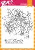
The stamp I used is "Beautiful Bouquet: Ranunculus" from WPlus9 and colored in with Zig Clean Color markers. I have a love/hate relationship with these markers as I cannot seem to make them work like other people do. I added a layer of Spectrum Noir Sparkle over the top. The sentiment is from PaperTrey Ink's "Pretty Peonies" set (retired).
I loosely used the sketch for the second card. I also used a card by my CAS-ual Fridays Stamps Design Team Mate, Shona Chambers, as inspiration. When I saw her black and white card I was blown away!!

I used CAS-ual Fridays Stamps "Modern Petals" stamp in blue as my focal point for this card. I knew when I saw Shona's card that I wanted to use blue ink for my version.

I also decided to use the sentiment as my focal point. I used Simon Says Stamps "You Matter" stamp set and matching die for the sentiment. The added touch of red really popped off the blue.

I also covered the die cut with Glossy Accents to give it a bit of shine. I also stamped a matching envelope. I did not line it up as well as the card but kind of like the look. I added some Nuvo Crystal drops in the middle of the flowers on the envelope in red to match the red on the card.
I thank you for stopping by today. I hope your day is as beautiful as mine has been!!
 Card #1 Supplies:
PaperTrey Ink "Pretty Peonies" set (retired),
Card #2 Supplies:
I had a little time to actually play yesterday and made two different cards for the "As You See It Challenge #147." I used the sketch and pulled from the pile on my desk for the first card.

The sketch that I pulled this from is below. There is also a kind of "theme" to go with it to interpret the sketch: Lacey and Lovely. It is up to you to interpret what goes across the top-lace or patterned paper?

I chose yellow gingham patterned paper as the large panel that goes partially across the top. This was actually my second choice. I first used a stencil and stenciled some lace BUT as it often is with me, I messed up and went out of the lines. So my second choice was my yellow paper. It went well with the yellow flower and was a good contrast to the red.

I added a vellum die cut underneath the circle for some intent and instead of stamping a sentiment underneath the patterned paper, I stamped it ON the paper. I just couldn't find a sentiment that looked good in the space underneath.

The stamp I used is "Beautiful Bouquet: Ranunculus" from WPlus9 and colored in with Zig Clean Color markers. I have a love/hate relationship with these markers as I cannot seem to make them work like other people do. I added a layer of Spectrum Noir Sparkle over the top. The sentiment is from PaperTrey Ink's "Pretty Peonies" set (retired).
I loosely used the sketch for the second card. I also used a card by my CAS-ual Fridays Stamps Design Team Mate, Shona Chambers, as inspiration. When I saw her black and white card I was blown away!!

I used CAS-ual Fridays Stamps "Modern Petals" stamp in blue as my focal point for this card. I knew when I saw Shona's card that I wanted to use blue ink for my version.

I also decided to use the sentiment as my focal point. I used Simon Says Stamps "You Matter" stamp set and matching die for the sentiment. The added touch of red really popped off the blue.

I also covered the die cut with Glossy Accents to give it a bit of shine. I also stamped a matching envelope. I did not line it up as well as the card but kind of like the look. I added some Nuvo Crystal drops in the middle of the flowers on the envelope in red to match the red on the card.
I thank you for stopping by today. I hope your day is as beautiful as mine has been!!
PaperTrey Ink "Pretty Peonies" set (retired),


Card #2 Supplies:


8 comments:
The yellow gingham is a great choice for your card. It's so bright and sunny and cheerful and goes perfectly with the flowers! And I just love the shiny die cut sentiment on your second card. What a bold statement it makes!
The yellow gingham on yellow looks great and is a fitting backdrop for your cheery flowers. I like your vellum leaves and the sentiment is a perfect fit. So glad you joined us at As You See It Challenges!
The bright and cheerful colours you've used are so right for the sentiment of your card. I love the red contrast with the yellow and the placement of those red enamel dots is perfect, The vellum leaves are a lovely addition. Thanks so much for joining us at As You See It.
Greetings Nora, wow both designs are really fabulous, love the bold colors.
Hugs Diane
2 totally different cards Nora - love the vibrant colouring on the first and the simplicity of the red, white and blue on the second!
Two fabulous cards, Nora! I love your yellow gingham paper with your roses and vellum and your blue 'Modern Petals' look amazing with your red die cut sentiment! I love how you brought it to a high shine, too...so striking!
Beautiful cards! Beautiful coloring and I really like the way you showcased those flowers! The vellum was a great idea! Thanks for joining us at As You See It!!
Wow. What a treat! Love the cheery feel of the first, the gingham with that bold pop of pink is great. And the graphic nature of the second in those slightly unexpected colors - yep, wow!
Post a Comment