Saturday, July 23, 2011

Stamp-A-Faire Challenge #3!!

For Paper Trey Ink's Challenge #3 we were supposed to create a window card and tie a piece of ribbon or twine from the window to the edge of the card.


I chose to use the hot pink color again for this card. I stamped with Stampin Up!'s Melon Mambo ink and used PTI's Flower Fusion #1 stamp set and Polka Dot Basics #2. I used Mat Stack #3 die by PTI to create the window for the flower to peek out of. I apologize for the photo but I didn't realize how blurry the image was when I took it. I like how this card came out but I think I will rethink the punched borders if I use this design again.
Nora

Stamp-A-Faire Challenge #2!

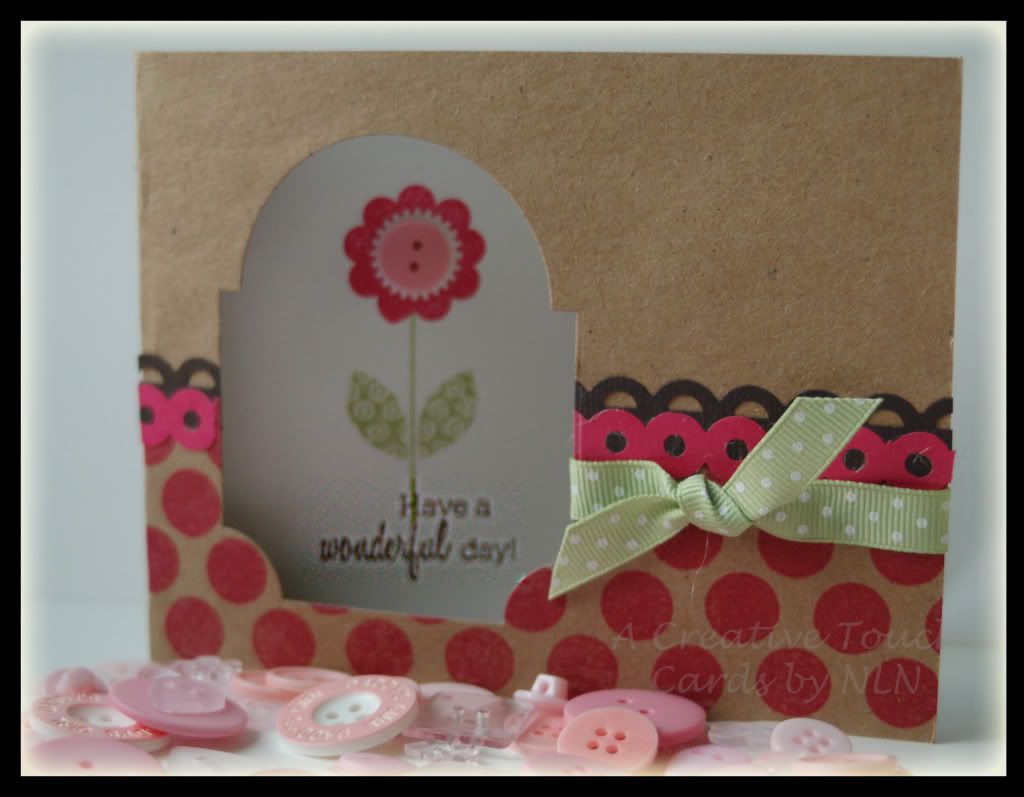
I am back again with my take on Paper Trey Ink's challenge #2. The challenge was to create a card using a hot pink, like PTI's Raspberry Fizz and pair it with a charcoal grey. For some reason, I only saw the "grey" part in the challenge and so I used the ONLY grey I have in my thousands of pieces of paper. It was a light grey, almost white. Guess what color cardstock I will be buying next? I used what I had and created a birthday card that I will send to my friend next month.


For this card, I used Paper Trey Ink's Cupcake Collection stamp set and die cut. I stamped it with Stampin Up! die ink in Melon Mambo and Pretty in Pink. I used Raspberry Fizz paper from PTI, Pretty in Pink from Stampin Up! and the gray is unknown. I had fun embossing various textures for this card and layering them over each other. All in all, I really like the way this card came out. I think I will be making a few more to go in my stash!!
Nora

Paper Trey Ink Stamp-A-Faire Challenge #1

I had a fun time playing along with Paper Trey Ink today and doing some of their Stamp-A-Faire challenges. I would have loved to go to their fun convention but alas, it was too far and not a great time to take off and go to Ohio. Instead, I played along for a while completing a few challenges.


The first challenge was  create a project featuring patterned strips that were created with some of of my favorite decorative elements. Since I am limited in the amount of PTI stamp sets that I own, I chose to stamp my background with PTI's Label Basics and sea spray chalk ink. I then distressed the edges with a tonic distress tool and inked with Vintage Photo Ink.


For the focal point of the card, I chose to use the PTI's stamp set Gracious Vases.  Again, I used chalk various colors of chalk ink. I punched the images into a circle and then inked with Vintage Photo Ink. 


I used my Big Shot to cut out some die cuts and layered the stamped images over them to make them pop. I wasn't sure how this was going to come out but am pretty pleased with the results. If you have time, go over to Nicole Heady's Blog and have some fun!!
Nora