Thursday, June 5, 2014

WPlus9's "Sweets and Treats" Cards

Happy Thursday!! I hope everyone is having a fabulous day.

Today at work we are celebrating a new co-worker and saying good bye to two lovely women with a little celebration. I thought I would post a few cards that I created using WPlus9's "Sweets and Treats" set to start the celebration off. I don't know about you but I cannot resist a lovely cup cake. If you must know, cup cakes or a piece of cake are my downfall when it comes to eating well. Especially chocolate!!

The first card I created I die cut and stamped one of the cup cakes, a flower and a stand from the "Sweets and Treats" set. I then colored them in with my Copic markers.


I layered the cup cake over a piece of vellum that was adhered to green card stock base and a fun panel of purple checked paper. I LOVE these two colors together. They make me so happy!!

I then die cut a banner and stamped the fun sentiment. I then used adhesive foam to make it pop.


Next I used a pin and stamped a little banner for over the cup cake. My last step was to add an assortment of sequins and a little Wink of Stella over the flower. I think this card is one of my new favorites.

Supplies:


My next two cards I copied from one of the WPlus9's designers. In fact, her card made me want this set in the first place. I cannot find the link and I apologize on that. I like to give credit when I can.

On the original card, the designer stamped five cup cakes. I die cut a piece of white card stock and could only fit three cup cakes on each of my cards. I then colored them in with Copic markers.

I mounted the first card on a blue A-2 base.


This card stock from Simon Says Stamp matched perfectly with the blue polka dots in the right cup cake. Please ignore the coloring on the red cup cake. For some reason, red Copics always bleed on me!!


To enhance a few of the elements, (the polka dots, the cherry, the tiny flower and the red flower middle) I used glossy accents. It is hard to see from the photo but it gives these details a shiny appearance.

I used the same design for my second card.


However, I mounted the panel with adhesive foam onto a lime green card base rather then blue.


Again I used glossy accents on some key elements and a Wink of Stella pen on the daisy. Instead of blue sequins, I added white.

I really enjoyed making these cards too. They were simple but I think came out oh so pretty!!

That is all from me today. I thank you for stopping by. Have a wonderful day!!

Nora
Supplies:


Tuesday, June 3, 2014

Retro Sketch #117

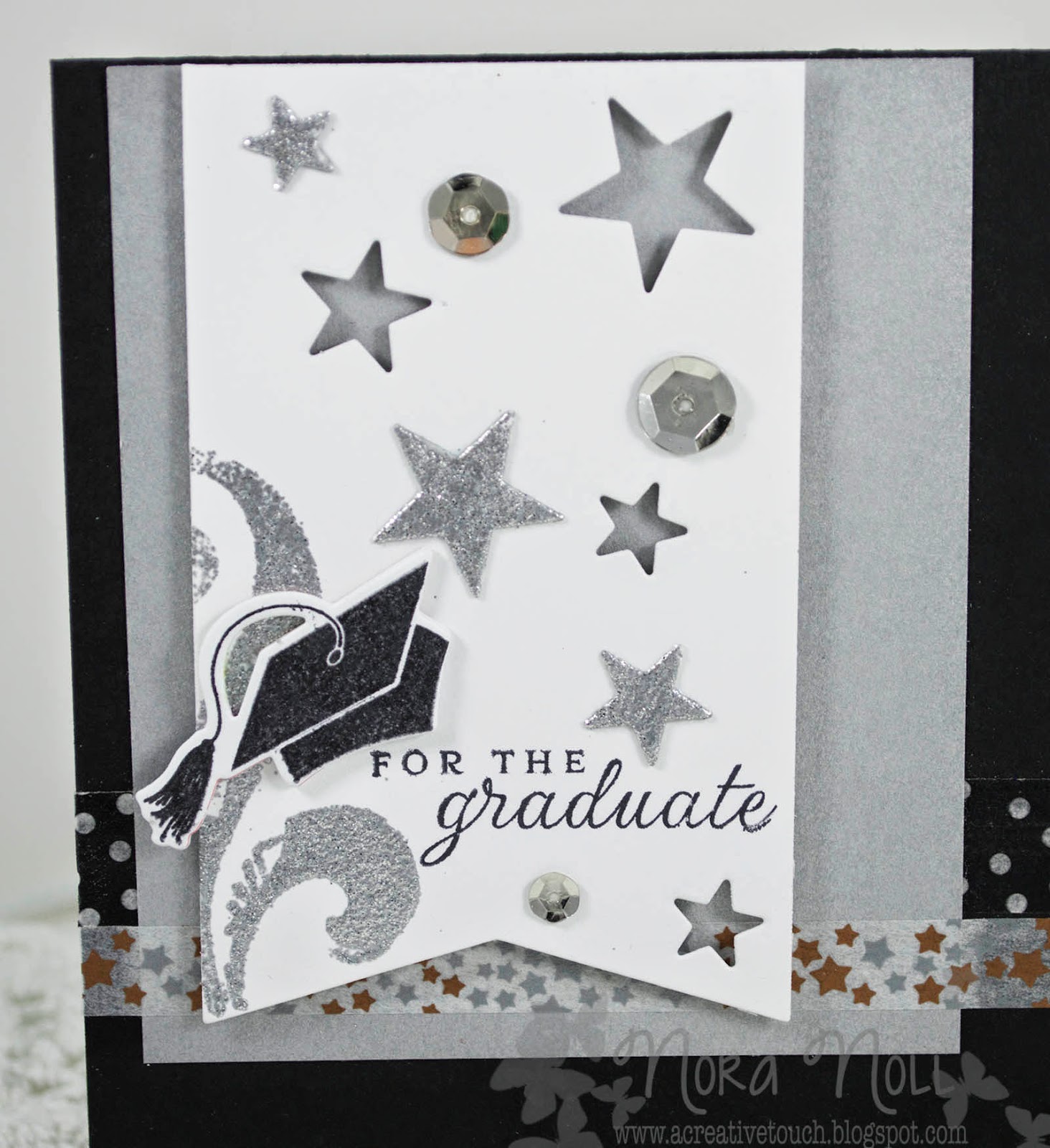
Hello everyone!! Just a quick post to join the retro sketch challenge this week. I created two graduation cards.


The first card I created I used the sketch but omitted one of the pieces of patterned paper and the bow.


I die cut a banner as the focal point and then die cut stars into the banner. I then heat embossed the star die cuts with silver sparkle embossing powder, as well as a stamped flourish.


I used two different Washi tape patterns for the horizontal pieces on the card. I liked how the card came out but thought it might be "too" much sparkle so I created a second card.


For this card, I used a smaller piece of silver paper for the background because that was all I had left. I then die cut stars in the banner but did not used the star die cuts. Instead I just used more sequins.


On the inside of both the cards, I used a scallop die cut on white paper and stamped two different sentiments.

I like how both of these cards came out but do not LOVE them. I think it is the colors. Since I was intending on bringing them to work to sell, I left the colors more generic and I believe that is what is bothering me. I am a lover of color!!

Thank you for stopping by. Have a great night!

Nora

Supplies:
TPC Studio stamps (Flourish)


Sunday, May 25, 2014

Papertrey Ink May 2014 Blog Hop

Happy Sunday!! I hope everyone is enjoying their holiday weekend. I know I am.

Yesterday I FINALLY planted my vegetable garden. The plants I bought from school were not looking so hot as the weather in CT has not been ideal for planting this year. They look better now that they are in the ground and I hope the survive. I will be crossing my fingers. (and no, I did not take photos, though I will now that I am typing this.)

Today I had time to play in my scrap room. I was supposed to be organizing (shhh!) but I felt like making a card instead. The organizing and the mess will still be there tomorrow for me to do, right? I am playing along today with Papertrey Ink's blog hop.


The challenge was to use the colors of melon and aqua. The photo below was the inspiration piece.


I love these colors together, don't you? I only wish I had a room I could redo with this pretty palate! 

When I started creating this card, I also intended on using this weeks retro sketch #116. I love this sketch but in the process of making my card, I went terribly array and did not even come close. This is the sketch:


 Here is the finished card:


See what I mean? The sketch and the card are not even close!! 

Today I am going to tell you all about the process behind this. When I read other people's blogs, I love it when they write about how they came up with the whole idea. In fact, creative people's minds fascinate me. 

Anyway, as I said before, I started out by wanting to use the sketch and using the two colors. Then when I started playing, I tripped myself up. Instead of this being a "quick" card, this took TWO HOURS!! Doesn't look like it, though, does it? I stamped the clock face first on a piece of white card stock. I used a stamping off technique to get the really light color. To be honest, I stamped this clock 4 times before I got the one that was "perfect" in my mind. I then stamped the sentiment. 

I knew I was going to use a Melon Berry base and some type of aqua accents. However, I screwed up and pulled out a piece of Berry Sorbet instead. I told you this was a total comedy of errors today!! The plain card base was too blah so I used Papertrey Ink's Polka Dot Basics II set and Melon Berry ink to stamp a polka dot background. (At least I got the melon ink right!) I then used an ink blender and blended more melon ink around the edges.


Next I die cut different doilies out of Aqua Mist card stock. I also knew I wanted to use a butterfly somewhere on the card so I originally cut PTI's "Beautiful Butterflies"out vellum. They were too big for the card so I had to go another route. I wound up cutting out so many "extras" to play around with that I have a bunch left over. Do you ever do that? This does not even show the "experiments" that I threw out!


I will use them on a later card but if you only knew how many times this has happened...I have tons of little bits from so many projects that I should just give them away. I hardly ever go through them again to use them up.

Sooooo, anyhow, I finally decided that my Martha Stewart butterfly punches were the perfect size I needed for the butterfly accent. I punched three, doused them in Aqua Mist ink, and adhered them together. I then adhered all my accents to the card front.


I am really happy with the results. Next time I hope it won't take me so long to create a card like this AND I will double check the ingredients!!

Thank you for looking! Have a great night!

Nora
Supplies: