Showing posts with label Retro Sketch. Show all posts

Thursday, January 1, 2015

Happy New Year, 2015 Goals and Retro Sketch #146

Happy New Year!! I hope everyone had a fabulous holiday. I took a bit of time off to enjoy my family and friends. I have so much to be thankful for in my life and have enjoyed this week more then I thought possible.

I made a list of a few "goals" I wanted to work toward in 2015. I really hate the word "resolution" because I really don't keep these. Goals are something I work toward on a daily basis. None of the goals I have for 2015 are earth shattering but I wanted to put them in writing here so that I had a record. So here is what I am striving for this year:

2015 Goals:

  1. To make some how to videos to post on my blog (very scary because a) I do not like my voice and b) I have never edited a video before. Any advice as to what software you use etc... would be welcome!!)
  2. To blog at least 3 times a week, with some "regular" features. I have many ideas just need to PLAN my time to implement the idea!!
  3. When I sit down to make a card, to make more then one using the same design. This doesn't sound hard but I have a difficult time making the same card twice. I get bored!!
  4. To continue my goal toward good health. I have the work out down now I need to get the eating healthy part started.
  5. To schedule more social time in with my friends. Being connected and having a support system is so important. I need to nurture my friendships more and let my friends know how much they mean to me.
  6. Last but NOT least-to actually send out my cards instead of having them sit in a box. I love to make cards but am the WORST at sending them to the people that I have made them for. 


Enough about the goals and now to the good stuff. I had a chance to play the other day and was inspired by the "Retro Sketch" blog to create not one but two cards using sketch #146.  It kind of gas 

The first card I created I used a purple color scheme. 


I used Altenew Stamps for the flowers and the sentiment. The frame is stamp by Paper Trey Ink.

Here is the sketch that was the inspiration:


Instead of making a square card, I chose to make a rectangle card, using the square as the centerpiece. 

Here is how I created the card:

1. For the bottom square, I die cut a piece of lavender Bazzill card stock and adhered it to a top closing card base. 

2. Next I adhered a die cut banner on an angle over the card stock. 

3. I die cut the frame out of white card stock and stamped it using Paper Trey Ink's "Slide Frame" stamp set with Tim Holtz Distress Ink in the "dusty concord" color. I then mounted the frame over the purple card stock at an angle.

4. I then stamped the flowers using Altenew's "Painted Flowers" in "dusty concord" and "shaded lilac" Distress Ink. The leaves were stamped in My Favorite Thing's "sour apple" ink. I then spritzed over the stamped square in Heidi Swapp "Amethyst" spray mist. After it dried, I mounted the square over the purple frame with foam adhesive. 


5. My next step was to stamp, cut and adhere the Altenew sentiment on the front of the flower square.

6. The last step was to adhere some purple gems and two sequins to the front. 

In spirit of my 2015 goals, I created a second card as well but used a different color scheme.


Instead of using card stock as the first square, I die cut a piece of pink patterned paper. I also double stamped the frame. First I stamped it in pink and then in red. Before I stamped the red, I misted water over the ink that was on the stamp.


Another difference between the two cards was that on this card I only used the banner on the left side of the card. 

I really am happy with the way both of these cards came out. This sketch was so fun to use as inspiration.

I thank you for taking the time to look today. Happy New Year!!

Supplies: 
Stamps-Altenew-"Label of Love" and "Painted Flowers," Paper Trey Ink-"Slide Frame"
Ink-My Favorite Things-"Sour Apple" and "Red Hot," Tim Holtz Distress Ink "Dusty Concord" and "Shaded Lilac," Memento "Tuxedo Black" and Simon Says Stamp "Doll Pink."
Paper-Paper Trey Ink-White, Bazzill Lilac and Ella and Viv "Tribal Tie Die #10," Fancy Pants "Sweetness"
Dies: My Favorite Things "Pierced Square Stax," Paper Trey Ink "Slide Frame" and "Banner" dies
Other: Sequins, rhinestones

Thursday, November 6, 2014

Retro Sketch #139, The Card Concept #22 and Throw Back Thursday

Happy Thursday!! I am so glad that the week is almost over. I need some time to relax.

Today  I am posting a card that I created using this weeks Retro Sketch #139 and The Card Concept #22: "Thank Fall" as my inspiration. I am also calling it a "Throw Back Thursday" card because I used a 2001 Stamping Up! retired stamp set "Season of Thanks" as the focal image. It definitely screams fall to me and is one of my favorites from the old sets that I still have from when I was a demonstrator.


I had fun using Copic Marker's to color in this image. I really had to stretch myself to get all those different browns in there. I was able to practice a bit of Copic coloring too. The sentiment strip from the sketch actually worked out well because it covered up some of the green that went a little bit wild that I couldn't quite fix!!

Here is the sketch and the image I used as my inspiration:


I used distress ink all around the edges of the patterned paper, colored image and card base to give it a more rustic feel. I have to pick a style to fit it into for the Card Concept challenge and I would say it was a "Clean and Layered" style. (Okay, minus the distress ink edges.)


That is all for tonight. I thank you for looking!!

Supplies:
Paper: My Minds Eye, Hero Arts, Basic Grey and Echo Park
Stamps: "Season of Thanks"-Stampin Up! (Retired) and "Talk Bubbles"-Simon Says Stamp!
Dies: Paper Trey Ink
Other: Memento Black Ink, Copic Markers, Jute

Tuesday, July 8, 2014

Inspired by this weeks Retro Sketche #122-a Thank You Card

Happy Tuesday! The weather does not know what it wants to do today so it is a good time to hide in my craft room. It is hot and humid out and has sprinkled on and off most of the day. It actually was refreshing to get rained on while I was doing my interval run this morning.

Today I am going to share a card with you that I created using Retro Sketch #122 as my inspiration.


I could not wait to start this challenge because I knew exactly what I wanted to use for the background. I used the MFT's ink splash from their "Abstract Art" stamp set and distress inks to create this fun, faux watercolor patterned paper. This is the card that I created:


I stamped each dot randomly by inking the stamp up, stamping off, spritzing the stamp with water and finally stamping on the watercolor paper. While the stamped image was wet, I re-inked the stamp and then stamped the dot again. Though the process seems intricate, it was really fast and easy to do. This helped to get the watercolor look to the dots. I like that the dots are not all uniform and in some areas are overlapping and in others, there is white space.

After the dots were dry, I used an MFT Blue prints die to die cut the watercolor paper. I wrapped purple jute around the top and adhered it to a dark purple card base.

I then adhered strips of pink, green and dark purple card stock in the  middle of the card front.  Next I adhered a stamped label over it using foam adhesive.


At first I was not going to add anything else but the label looked naked. I decided to die cut and stamp flowers in the same colors as the dots using WPlus9's "Fresh Cut Florals" set. I adhered the flowers using both dot and foam adhesive.


Again, I looked at it and thought it was missing something. Am I the only one like this? I decided the card needed a bit of glitter in the centers so I dug out a couple shades of purple Stickles I owned. My last step was to adhere a few sequins.

I had a lot of fun making this card and will be using this sketch again. Coming up with ideas for the background was my favorite part.

Since I used a ton of die cuts on here, I am going to enter this into Virginia's View Die Cut Challenge #5. If you haven't checked the blog out, run. She is so talented!!


Thank you for looking!! Hope you have a wonderful Tuesday!!
Nora

Supplies:


Tuesday, June 3, 2014

Retro Sketch #117

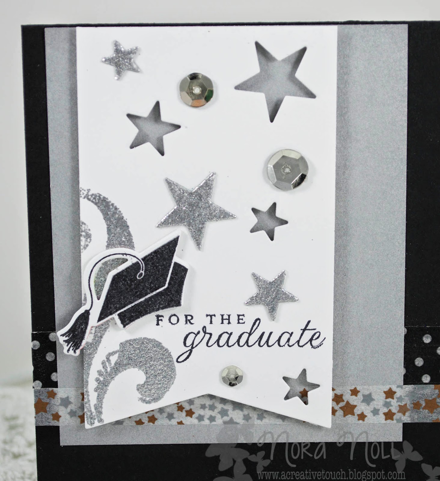
Hello everyone!! Just a quick post to join the retro sketch challenge this week. I created two graduation cards.


The first card I created I used the sketch but omitted one of the pieces of patterned paper and the bow.


I die cut a banner as the focal point and then die cut stars into the banner. I then heat embossed the star die cuts with silver sparkle embossing powder, as well as a stamped flourish.


I used two different Washi tape patterns for the horizontal pieces on the card. I liked how the card came out but thought it might be "too" much sparkle so I created a second card.


For this card, I used a smaller piece of silver paper for the background because that was all I had left. I then die cut stars in the banner but did not used the star die cuts. Instead I just used more sequins.


On the inside of both the cards, I used a scallop die cut on white paper and stamped two different sentiments.

I like how both of these cards came out but do not LOVE them. I think it is the colors. Since I was intending on bringing them to work to sell, I left the colors more generic and I believe that is what is bothering me. I am a lover of color!!

Thank you for stopping by. Have a great night!

Nora

Supplies:
TPC Studio stamps (Flourish)